
Site Settings
Overview of the IM Base Site Settings screen.
Overview
Site Settings is the IM Base administration screen for configuring theme-wide options. It is available under IM Base → Site Settings and is typically used during site setup or when adapting the theme to a project.
The screen includes image, layout, responsive, and scrolling settings. These options control site images, page and mobile layouts, responsive breakpoints, header and mobile bottom-bar scroll behavior, and the fixed-header offset used by in-page anchors and the Table of Contents.
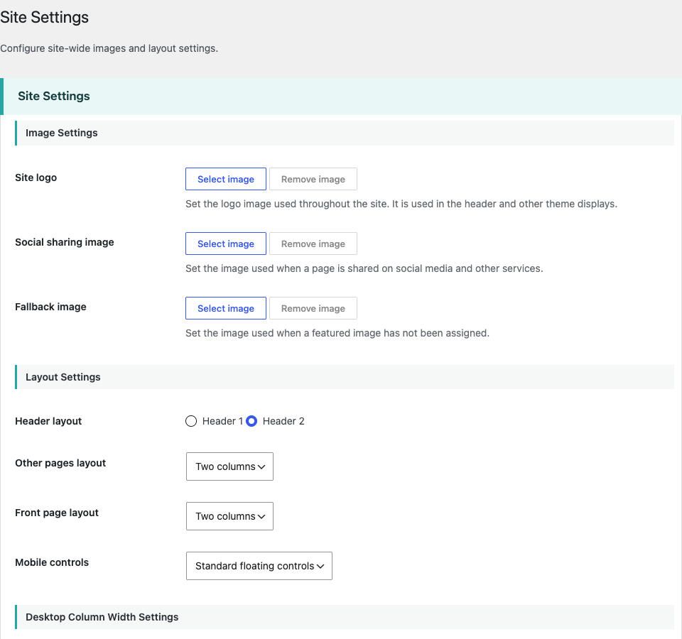
Image Settings
Image Settings provides three site-wide image options under IM Base → Site Settings: Site logo, Social sharing image, and Fallback image.
The Site logo is used throughout the site, including the header and other theme displays. The Social sharing image is used when a page is shared on social media and other services. The Fallback image is used when a featured image has not been assigned.
Layout Settings
Layout Settings control the header, page layouts, and mobile controls. Select Header 1 or Header 2, then choose a one-column or two-column layout independently for the front page and other pages. For mobile controls, choose Standard floating controls or Fixed bottom bar.
You can enable custom desktop column widths and set the site width, sidebar width, and column gap in pixels. You can also enable a custom mobile drawer width and specify it as a percentage. The corresponding width fields become available when each customization option is enabled.
Responsive Settings
Responsive Settings define the viewport breakpoints for the Mobile, Tablet, and Desktop layouts. Set the Mobile maximum width and Tablet maximum width in pixels. Mobile applies up to its maximum width, Tablet applies above the Mobile maximum through the Tablet maximum, and Desktop starts at the next pixel above the Tablet maximum.
By default, Mobile applies at 764px and below, Tablet from 765px to 1024px, and Desktop at 1025px and above. Changing these values updates CSS loading, JavaScript breakpoint detection, and responsive behavior.
Scrolling Settings
Scrolling Settings configure the scroll behavior of the Desktop header, Mobile header, and Mobile bottom bar. For each element, choose Hide on scroll or Always visible.
Fixed Header Offset specifies the fixed header height in pixels. IM Base uses this value for in-page anchor links, the Table of Contents, and current heading detection.